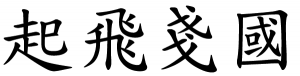
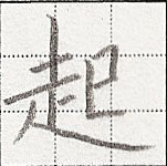
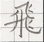
This article about handwriting Chinese characters is written by Harvey Dam, currently enrolled in the World Language master’s degree program at the University of Utah. He’s a prolific poster on Chinese Forums (user name Hofmann), which is where this text was originally published as a series of blog posts. It is published here with permission of the author. I wanted to publish this article here on Hacking Chinese because I think it contains unique and useful material. I find it particularly useful because it focuses on actual handwriting and contains lots of real examples with scanned handwriting samples rather than typed characters. The “minimum requirements” in the title doesn’t mean that all students of Chinese need to know everything here, but if you care about handwriting, you probably should.
Handwriting Chinese characters: The minimum requirements – Part 1
This post is meant to provide a clear-cut standard for beginners regarding Chinese handwriting using common hard-tipped writing instruments like pencils and pens, focusing on regular script (楷書). This is necessary because commonly available materials provide inaccurate information or stray too far into aesthetics too early, while neglecting the basics. My goal here is not to get you to write well, but to write correctly. The examples I show are made with a pencil, only caring to ensure that things are correct where they should be, with no attention paid to aesthetics.
First, some axioms.
- Writing is a form of communication through symbols. Recognition of these symbols without distraction requires them to adhere to certain rules. These rules are called 書法, “writing rules.”
- Characters in regular script are recognized based on the length, direction, and placement of strokes. Stroke thickness is not essential. Therefore, regular script can be written correctly with a monoline writing instrument. However, an atypical scheme of line thickness variation that becomes distracting is still wrong.
With that, your goal when writing (regardless of writing instrument) should be to communicate without distraction. The most common potential distraction when writing is producing wrong characters. In general, writing something that has not been commonly employed in exemplary pieces of writing for that particular morpheme will probably result in a wrong character. More concretely, the difference between a right and wrong character can depend on:
Substitution of one character for another, e.g.
..instead of…
Substitution of one component for another, e.g.
…for…
Absence of a required stroke (which may result in a substitution), e.g.
…for…
An extra stroke, e.g.

…for…
Stroke placement is incorrect, e.g.
…for…
Substitution of one type of stroke for another, e.g.
…for…
Width relationship of certain strokes are incorrect, e.g.
…for…
Height relationship of certain strokes are incorrect, e.g.
…for…
Width relationship of certain components are incorrect, e.g.
…for…
An opening where there should be none, e.g.

…for…

Lack of an opening where there should be one, e.g.
…for…
Visibly incorrect stroke order, e.g.
…for…
I think that about covers it. The first piece of homework you have to do, then, is to learn to recognize and reproduce the basic strokes of regular script. They are most reliably recognized by their orientation and curvature. The number of different strokes varies depending on how you count. I only include those which I think differ significantly in technique.
A horizontal stroke, commonly called 橫, is written from left to right. It can be truly horizontal or tilted up at the right a bit. It rare cases it can be tilted down, but not doing so in such a case will not make the difference between a right and wrong character. It may bow up (most commonly) or down in the middle, but not extremely. If you vary the thickness, it must be thick on both ends.
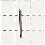
A vertical stroke, commonly called 豎, is written from top to bottom. It must not curve. In most cases it should be ideally truly vertical. In some cases such as in the second stroke of 五 it can slant and still be a vertical stroke as long as it does not curve. When written with line width variation, both ends are usually thick, although in some cases it can end in a point, and sometimes it must end in a point.
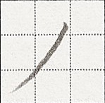
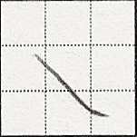
A positive-sloped stroke, commonly called 撇, is written from the upper right to the lower left. Lengths and curvatures of these strokes vary greatly. It usually bows down in the middle. In rare cases it must either be completely straight or bow up, such as the second stroke of 為 (examples). If you vary thickness, in most cases it must start thick and end thin. In some cases, such as in the third stroke of 鹿, it may start with a point, however not doing so will not result in a wrong character.
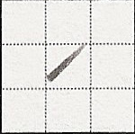
Dots, commonly called 點, are short strokes going in some downward direction, written from the top. When writing with varying line thickness, start with a point and increase thickness until the end.
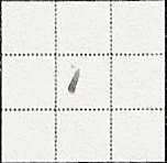
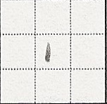
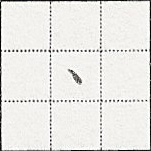
The dot to the right can be lengthened using the same technique, resulting in a straight or upwards-bowing negative slope stroke, called 長點 or 反捺.
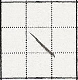
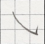
A negative slope stroke that bows down in the middle is called 捺. At the top, if it is closer to horizontal, there is initially a rightward motion. If it is steeper, it starts directly in the downward bow. If it starts in the middle of another stroke, it starts with a point. If not, it likely must start thick, as in the last stroke of 之 (examples).
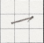
A stroke that is written from the bottom left to the upper right, and tilts up more than a horizontal stroke, is called 提. These are never the last stroke of a character. They start thick and end thin.
A round curve of about 90 degrees is called 彎. They are usually a transition between a vertical and horizontal stroke.
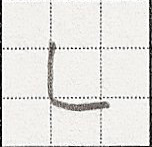
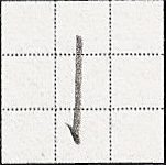
Hooks, called 鉤, are short attachments to major strokes. Most of them are very straightforward. On horizontal strokes, hooks can only go down. On vertical strokes, hooks can only go left.
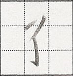
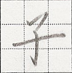
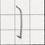
One stroke only occurs with a hook. I don’t know what it’s called, but it occurs in the last stroke of 子 and the second stroke of 狗. It is rather vertical but bows to the right, starting thin and ending thick (where the hook starts, which ends thin again).
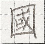
Hooks attached to rather steep 捺 are likely called 斜鉤. However, there are steep 捺 where you must not hook, as in the 4th to last stroke of 國 (example). The hook should point straight up or slightly to the right, even if the next stroke occurs left of it, except in 心 and 必, where it should point left.
Corners are the end of one stroke and the beginning of another. Corners can be correctly made by lifting your writing instrument up and starting a stroke that covers the end of the previous stroke. However, if at the end of one stroke you feel that you are prepared to start another, then go ahead and connect them. Note that stroke counts for dictionary classification are made assuming cornered strokes are connected into one where possible. Therefore, while I would write 幺 in 5 separate strokes, a dictionary would say it has 3 strokes.
Handwriting Chinese characters: The minimum requirements – Part 2
Now that you can identify and reproduce all strokes in regular script, it’s time to learn to use them correctly. When looking at an example character, observe the writer’s intent regarding:
- What kind of stroke is employed.
- In relation to other strokes and components,
- Where it starts
- What it passes through
- Where it ends
- In what order it’s written
A note about stroke order: the tl;dr about it is to memorize this list and use Japanese standard stroke order references like this in order to produce correct stroke orders. For more details, read this.
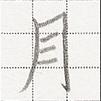
Now I will elaborate a bit about intent. When you try to write 10 of the same character the same way, they will all be different because of human imprecision, although you have the same target character in your mind. The character in your mind is a grapheme (underlying form), and what is written is the surface form. By observing multiple surface forms, you will get a better idea of what the grapheme must be. For example, observe the 1st and 2nd strokes of the many examples of 月 here. In most examples, both of them touch to form a corner. In some examples, they don’t touch or almost touch. In even fewer examples, they pass through each other. By observing these examples, one should conclude that they should be ideally touching to form a corner, although if you write 10 of them, and 2 of them look like this:
…and one of them looks like this:
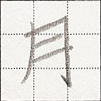
…that’s OK. However, no amount of technical deficiency would produce something like this:
Therefore, when writing Chinese characters, it is necessary for your intent to be correct, even if your rendition in some instances is not.
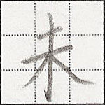
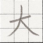
Now let’s practice our observational techniques on another character. Look at 大 here. Only look at regular script examples. Here is what I see stroke by stroke:
- In all examples, the first stroke is a 一. I conclude this is the rule.
- In all examples, the second stroke is a 丿 that begins somewhere obviously above the first stroke, centered on it, and passes through it, ending either under the beginning of the first stroke or obviously to the left. In most examples it is obviously to the left. I conclude that ideally it is obviously to the left, although not quite getting there is OK.
- In all examples, the third stroke is a ㇏ beginning at the intersection of the first and second strokes, end extends well past the end of the first stroke, at around the same height as the second stroke. I conclude this is the rule.
Now I try to reproduce it.

- The first stroke is a 一. ✓
- The second stroke is a 丿 that begins somewhere obviously above the first stroke, centered on it, and passes through it, ending either under the beginning of the first stroke or obviously to the left. ✓
- The third stroke is a ㇏ beginning at the intersection of the first and second strokes, end extends well past the end of the first stroke, at around the same height as the second stroke. ✓
If I break the last rule one way or another:

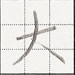
…I will produce wrong characters. On the left I wrote the first stroke too long and/or the last stroke too short. On the right I replaced the last stroke with a 丶, which was in none of the regular script examples.
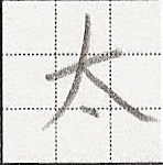
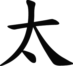
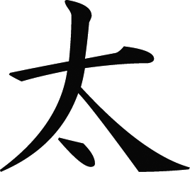
Now that you know how to write 大, you can use it to learn other characters that contain it, like 天 or 太. Let’s look at 太 here.
- The majority is written like 大. Since you know that already, there is no need to relearn.
- There is a 丶 placed between the 2nd and 3rd strokes. Most examples place it directly under the intersection (and not halfway between the 2nd and 3rd strokes).
More on that last point, observe this. The dot is placed under the intersection. If it were halfway between the 2nd and 3rd strokes, it would be to the right of the intersection. Technical imprecision can produce a dot that goes anywhere in the area between the 2nd and 3rd strokes, but most examples seem to aim directly under the intersection. Also, some learners who are used to looking at modern typefaces will likely have a grapheme in their heads with the dot attached to the 2nd stroke, even if it ends up left of the intersection. This is because modern Chinese regular script typefaces render it so. Here is DFKai-SB:
Compare with a Japanese typeface Epson 正楷書体M:
Although technical imprecision could cause someone meaning to put it under the intersection to attach it to the 2nd stroke, an intent to do so is inaccurate. One can avoid this by always using good examples. Unfortunately, the best examples are rarely presented to beginners. The tl;dr about good examples is go to a 書法字典 like 9610.com, search for what you want (in Simplified Chinese), and prioritize 歐陽詢, 顏真卿, and 柳公權, being careful not to learn a wrong character because they are misclassified.
This might seem like a lot of work, but if you do it, you will find that you will only need to look up simple characters, as complex characters are made of simple components. Furthermore, it isn’t much additional work if you are learning characters, as observing example characters in detail only strengthens your character memory.
Handwriting Chinese characters: The minimum requirements – Part 3
In part 2 I introduced to you some things you should look for when observing example characters. To review, they are
- What kind of stroke is employed.
- In relation to other strokes and components,
- Where it starts
- What it passes through
- Where it ends
- In what order it’s written
Now we will do some further exercises in observing examples such that good graphemes make it into you head.
First, let’s do one exercise regarding length of horizontal strokes. Do you know how to write 三? If you’re like most people you probably think the first stroke is longer than the second. Look at these. You should see that they are actually pretty much the same length. If there is any significant difference, then the second stroke is longer. But most importantly, the third stroke is still much longer than the first two.
And so here I give you a rule about regular script: In any one character there can be no more than one thing that extends far to the right, and if it’s a horizontal stroke, it likely starts on the far left, spanning the whole character. Everything else should usually be much narrower. Therefore, when a character has many uncontained horizontal strokes (i.e. not in 目 or something), pay attention to which one is longest. It will be much longer than the others. Let’s examine this in a few more characters.
A close call is not acceptable:
The difference between the longest horizontal stroke and the others must be obvious:
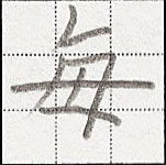
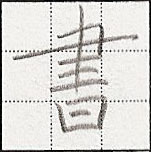
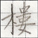
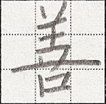
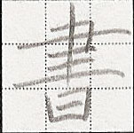
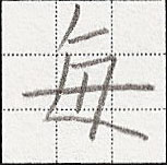
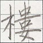
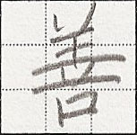
(Verify on 9610.com: 書, 每, 善, 樓.)
And remember, use good examples to make sure the long horizontal stroke is the right one.
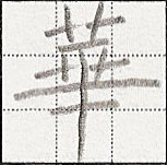
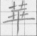
華 ←What does that look like to you? Does it look like any of these? Or is it more like this?
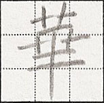
If that looks wrong to you, then you’re in good shape, because it should be like this:
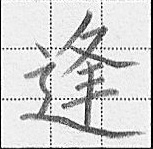
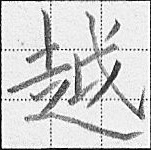
Now, remember that the rule says “in any one character there can be no more than one thing that extends far to the right.” This thing doesn’t have to be a horizontal stroke. It can be a ㇏ or any hook to the upper right, like ㇂ (or 乚). In any character there will be at most one of ㇏ or ㇂ or 乚 or long horizontal strokes. This rule has a name in Chinese: 一字不二捺. You should remember from before that 捺 refers to ㇏, but in this context, it refers to all of ㇏, ㇂, 乚, and long horizontal strokes. If you find yourself writing ㇏ or ㇂ or 乚 and it isn’t the rightmost thing in a character, you’re probably doing something wrong.
Observe the following wrong characters:
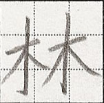
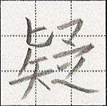
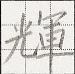
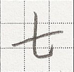
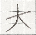
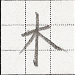
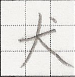
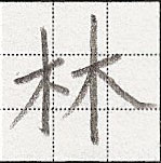
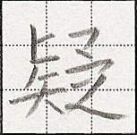
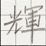
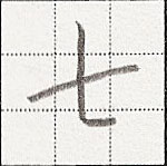
林 contains two 木. You know that 木 ends with a ㇏ but if you write 林, the first one has to change to 丶. If not, two problems will arise: (1) there are more than one ㇏ and (2) there is a ㇏ that is not the rightmost thing of the character. In 疑 there is the ㇏ at the end, but many people like to write a hook on 匕, and if you don’t kill it in 疑, you’ll end up with both a 乚 and a ㇏. Remember that there can be at most one of these. 輝 has 光 on the left. 光 ends with 乚 when written alone, but because it isn’t the rightmost thing in the character, the hook must come off, which results in a bare horizontal end, and because there is more stuff to write to the upper right, this bare horizontal end becomes a ㇀. In 七 there are both a long horizontal stroke and a 乚. Furthermore, 乚 isn’t the rightmost thing. And you should remember 大 from Part 2. The problem in this context is that there are both a long horizontal stroke and a ㇏. Observe these characters corrected:
Next, I will show you more rightward-extending things that can’t contend for rightwardness with anything else: components like 宀 and 皿.

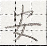
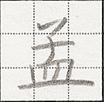
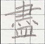
…the key word being “contend.” Notice 宀 being most rightward in 寶, but giving it up in 安 to the 一 in 女. In 孟, there is 子 and 皿, both having long horizontal strokes when written alone, but when written together 皿 dominates. In 盡 we have 聿+火+皿. 聿 and 皿 have long horizontal strokes when written alone, but in 盡, 聿 dominates.
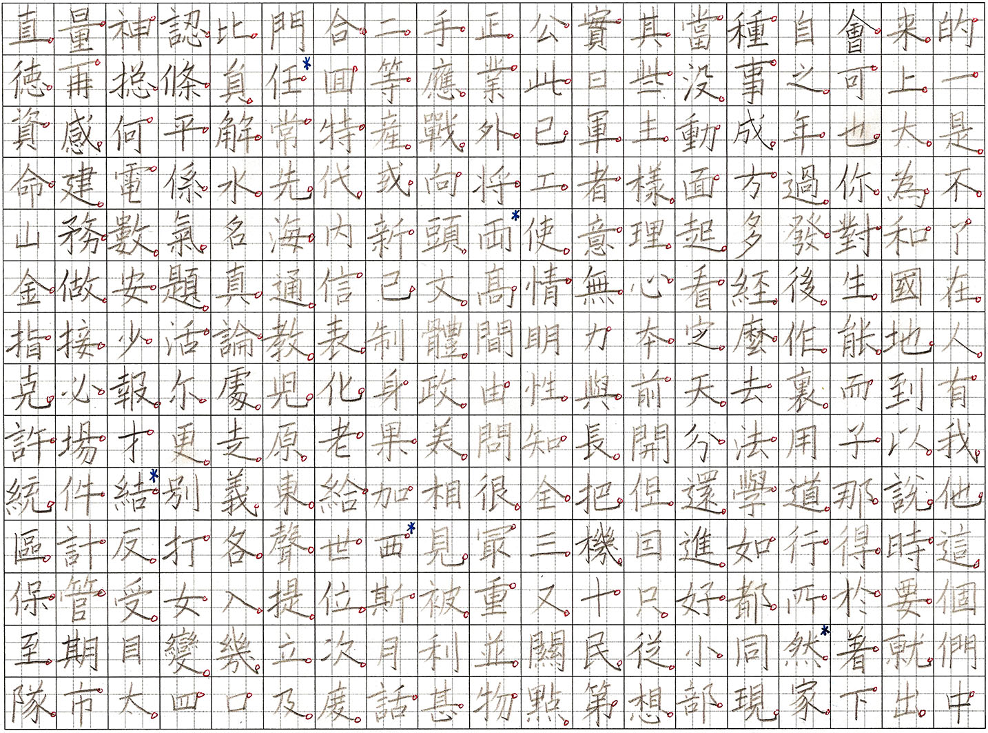
Below I have written the 266 most common characters in Mandarin as further demonstration of this rule. I have circled the rightmost extender in each character if there is one. Sometimes the character doesn’t have one, such as when the rightmost thing is a vertical stroke, as in 個. There will be no ㇏, ㇂, 乚, or long horizontal strokes that do not have a red circle (except in 心), unless I have written incorrectly. A blue asterisk means that there are other correct ways of writing the character where a different stroke or component is extended to the right.
Finally, I will show you some characters straight out of my computer that break this rule:
This is DFKai-SB, or 標楷體, which exhibits the standard character forms of the Republic of China.
Quiz question: Do you know how to correct them?
Answer:
Handwriting Chinese characters: The minimum requirements – Part 4
Let’s start with a…
Warm up:
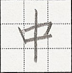
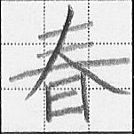
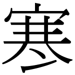
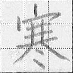
Kenny asks Eric how to write 春. Eric says “Write 三, then write 人 centered on that, then write 日 under that.” If Kenny follows Eric’s instructions exactly, will he write 春 correctly?
Answer:
Moving on. In this post I want to go over gut feeling. I hope over this series you’ve developed some. Here are some more weird things you might encounter that, like wrong width-relationships, should make you feel like something’s off.
One thing is the ㇀ (提) stroke, or rather misuse thereof. This stroke usually comes into being as a modification of some other stroke, usually to ease transition into starting the next stroke. Think of all the ㇀ in the characters you know. Likely there is something following it to the upper right. This is also why ㇀ is never the last stroke of a character. If you find yourself writing ㇀ as the last stroke of a character, then there are two possibilities:
- It should actually be some other stroke, this stroke being what became ㇀.
- You have written in the wrong stroke order.
As an illustration of number 1, here are a few characters in DFKai-SB:
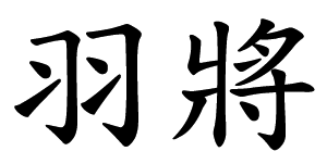
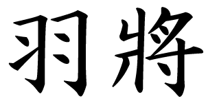
In 羽, there should only be one ㇀: the 3rd stroke. This is only a ㇀ to ease transition to the next stroke that begins to the upper right. The last stroke should be a 丶 just like the 5th stroke. To make it ㇀ would point it at nothing. In 將, the 8th stroke should also be 丶 because the next stroke starts below it. There is nothing right of it to write. Observe these characters written correctly in Epson 正楷書体M:
This is also the case with the ice radical 冫 as in 冷. The underlying form should just be two 丶, one on top of the other. However, because it is often followed by something to the upper right, the bottom 丶 becomes ㇀. This leads to such hypercorrections as:
That would be Adobe 明體 Std L. Observe this corrected:
As for number 2, let’s say you think the stroke order of 耳 is 一 丨 丨 一 一 一, and let’s say you look through examples of 聞 because you can’t find any 耳 in regular script, and it seems to end with ㇀. You feel like something’s wrong here. Actually 2 things: (1) the stroke order is wrong and (2) you probably extended the wrong horizontal stroke. Here I give you Epson 正楷書体M:
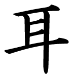
…and here is 耳 correctly written with stroke order from black to red:

And as you can see, the last stroke is actually 丨. Enough about ㇀.
Next, a bit about 又. This is very a common character building block. In many typefaces you’ll see the 2nd stroke starting where the 1st stroke started, forming a corner:
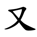
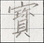
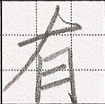
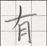
If your gut feeling has developed sufficiently, you’ll find it quite awkward to do so, i.e. to write such a long 一 before turning a corner into a 丿. That is because all of these instances are short, e.g. in 夕, or it’s actually a ㇀ like in 水, and so 又 written in this way is wrong. Let’s look at the etymology. You should see that this was a picture of a right hand, and likely the original character for 右. Look at the etymology for 右 and you should also see that it’s just 又 with 口 under it (which should also explain the stroke order of 丿一 for the tops of 右, 有, and 布), and finally look at examples of 又, and you should see that in all examples, even that first one that’s usually wrong, there is an opening in the upper left. And you should also notice that in anything that looks like 又, such as 攵 or 夂 or 夊, the last stroke doesn’t start at the beginning of the 一.
Next, I will talk about variants. The Chinese call these 異體字, although this term implies something nonstandard or unorthodox. I consider two characters variants if they differ in stroke type or placement. That means 太 with the dot attached to the 2nd stroke and 太 with the dot centered under the intersection are different variants. The ROC’s MOE variant dictionary doesn’t even differentiate them. And of course, not all variants are correct.
So, here you are, probably not too experienced with writing Chinese, faced with so many variants and big bad me, who can pick wrong characters out of computer fonts. What do you do? The short answer is: pick one way to write your entire vocabulary and stick with it. As for which variant to pick, pick the most popular among the best examples of regular script. Again, these are 歐陽詢, 顏真卿, 柳公權. Avoid obscure variants. They hinder communication among those who are not well read, or are distracting to those who are. Furthermore, if I see an obscure variant in your writing, and I also see wrong characters, that will not leave a good impression. And remember, only wrong learning and/or carelessness can produce wrong characters; technical deficiencies cannot produce wrong characters, as I illustrated in Part 2 using 月. Also, if you feel like there is a character that is just too awkward to write in its orthodox form, there is likely a common variant that is easier. Examples I can think of are 骨, 斷, 節, 乘, 夷, 皆, 鬼, 策..
However, if/when you get a feel for what is legal and what is not legal, you will find that there is quite a bit of freedom in Chinese writing, and it will feel easier than ever before.
Handwriting Chinese characters: The minimum requirements – Part 5
This is both a review and a quiz. There are no new ideas here.
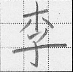
1. What is 語, with 忄 in place of 言?
a. 誤
b. 吾
c. 情
d. 悟
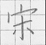
2. Observe the characters 畢 and 華. Choose the incorrect character.
a.
b.
c.
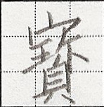
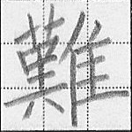
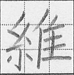
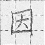
3. Observe the characters 雖 and 雅. Choose the incorrect character.
a.
b.
c.
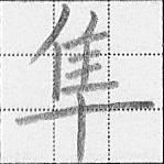
d.
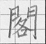
4. Observe the characters 木, 季, and 業. Choose the incorrect character.
a.
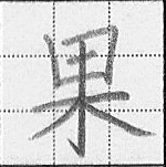
b.
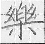
c.
d.
5. Choose the correct character.
a.
b.
c.
d.
6. Choose the correct character.
a.
b.
c.
d.
7. Observe the character 必. Choose the correct stroke order, from black to red.
a.

b.

c.

Answer key:
2. c
3. a
4. a
5. a
6. b
7. a

Tips and tricks for how to learn Chinese directly in your inbox
I've been learning and teaching Chinese for more than a decade. My goal is to help you find a way of learning that works for you. Sign up to my newsletter for a 7-day crash course in how to learn, as well as weekly ideas for how to improve your learning!
10 comments
The name of the stroke you didn’t know, the one in 子 and 狗, is 弯钩.
Surely the best stroke of all must be: 横折折折钩. 🙂
With respect to 一字不二捺 : What about wo (I) then? Google gives 我, which apparently breaks the rule regarding rightmost extenders. I wonder what would be the correct way of writing this character.
There is no 捺 (your so-called extender) in 我.
how can I hand writing chinese?
I don’t see anything wrong with the 有… they show the same stroke order?